Client: Nippon Paint
Role: Lead Agency Partner
Capability: Design-Led Communication · Complex Product Simplification · B2B Creative Education
Nippon Paint – Fan Deck
Campaign Essence
Colour is not just a choice — it’s a feeling with intention.
This campaign reintroduced the Nippon Paint Fan Deck as a master colour specification tool that helps professionals translate mood, emotion, and design intent into precise, usable colour codes.
Strategic Thinking
The challenge wasn’t the number of colours, but complexity.
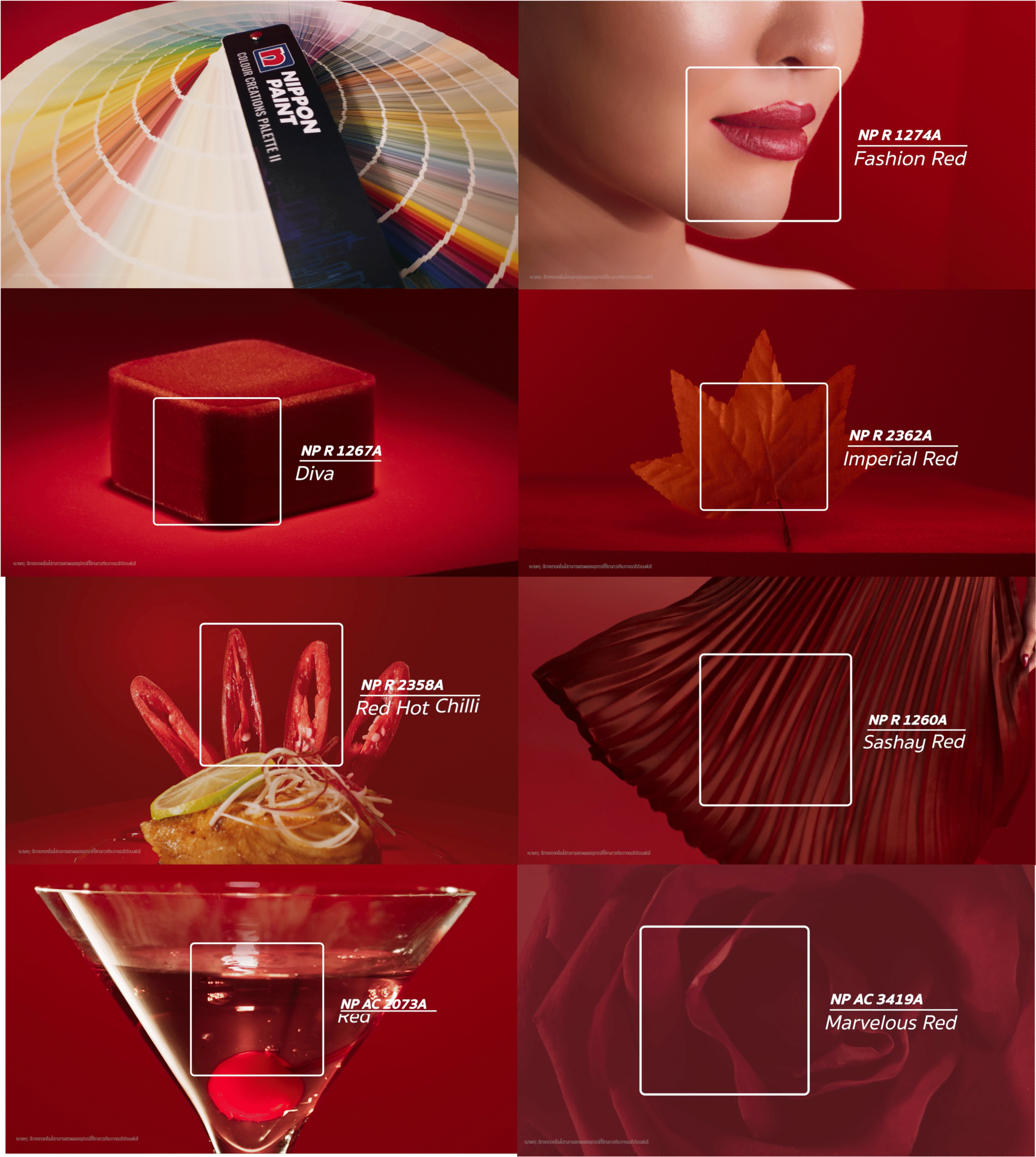
We repositioned the Fan Deck from a technical catalogue into a mood-driven design companion — making 2,338 shadesintuitive, inspiring, and practical for architects, designers, developers, and contractors. By organizing colour through emotion and real-life context, we accelerated decision-making without sacrificing creative depth.
Creative Solution
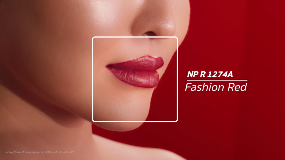
We developed a thematic explainer video built around the core idea “Every mood has a code.”
Using lifestyle-led visuals, real-space context, and emotional cues, the film demonstrated how diverse moods, materials, and environments can be translated into precise Nippon Paint colour codes across the full 2,338-shade spectrum.
Result
Clarified the Fan Deck’s value for B2B audiences and strengthened adoption among design professionals.
Elevated Nippon Paint’s perception as a future-ready partner that bridges creativity, specification, and real-world application.